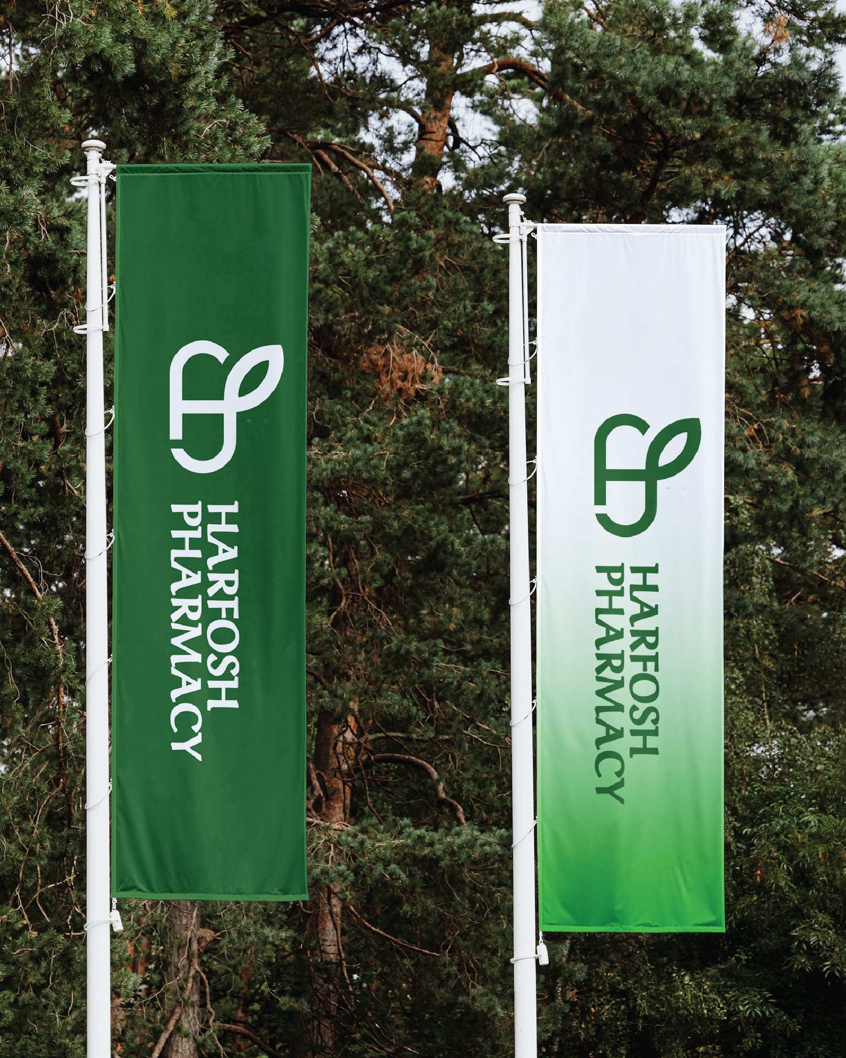
Breaking away from convention was the motto in designing this logo for Egypt's largest pharmacy chain in Fayoum Governorate.
Instead of the usual cup and snake symbolizing pharmacies, we opted for a logo depicting a medicine capsule merged with an herb, shaped into the initials of the pharmacy's name.
The green color chosen represents nature, tranquility, growth, and healing. Thus, the logo for Pharmacy Harfoush embodies innovation in pharmaceutical branding.